Pixelated Evolution

This is a project, written in Python, that simulates evolution. I like to think of it like “evolution where pixels are the unit of information”.
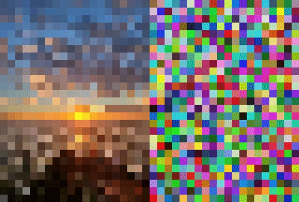
Above, you can watch the right side of the image, starting from random noise, evolve to match the left side.
The end goal of this project is to create an environment in which to examine the process of evolution and run tests on it. I’m also going to create a web interface intended to teach evolution in a visual and easy-to-understand way: as the image evolves visually, the evolutionary family tree will be generated alongside it.
The core loop is: Parent image creates child images with mutations. Child images closer to the target image (higher fitness) have more children of their own. That’s it.
There are a number of different parameters and modes that can be set that shape evolution: generation size, children distribution as function of parent fitness, mutation fraction (can be set as function of fitness), etc.
Evolution is interesting to me because of how it contrasts with machine learning algorithms: it is totally ‘unguided’ which has advantages and disadvantages, and it is much simpler. Using the Pixevo framework, I could compare high-level evolutionary algorithms to ML algorithms in a visual and easily interpretable way.
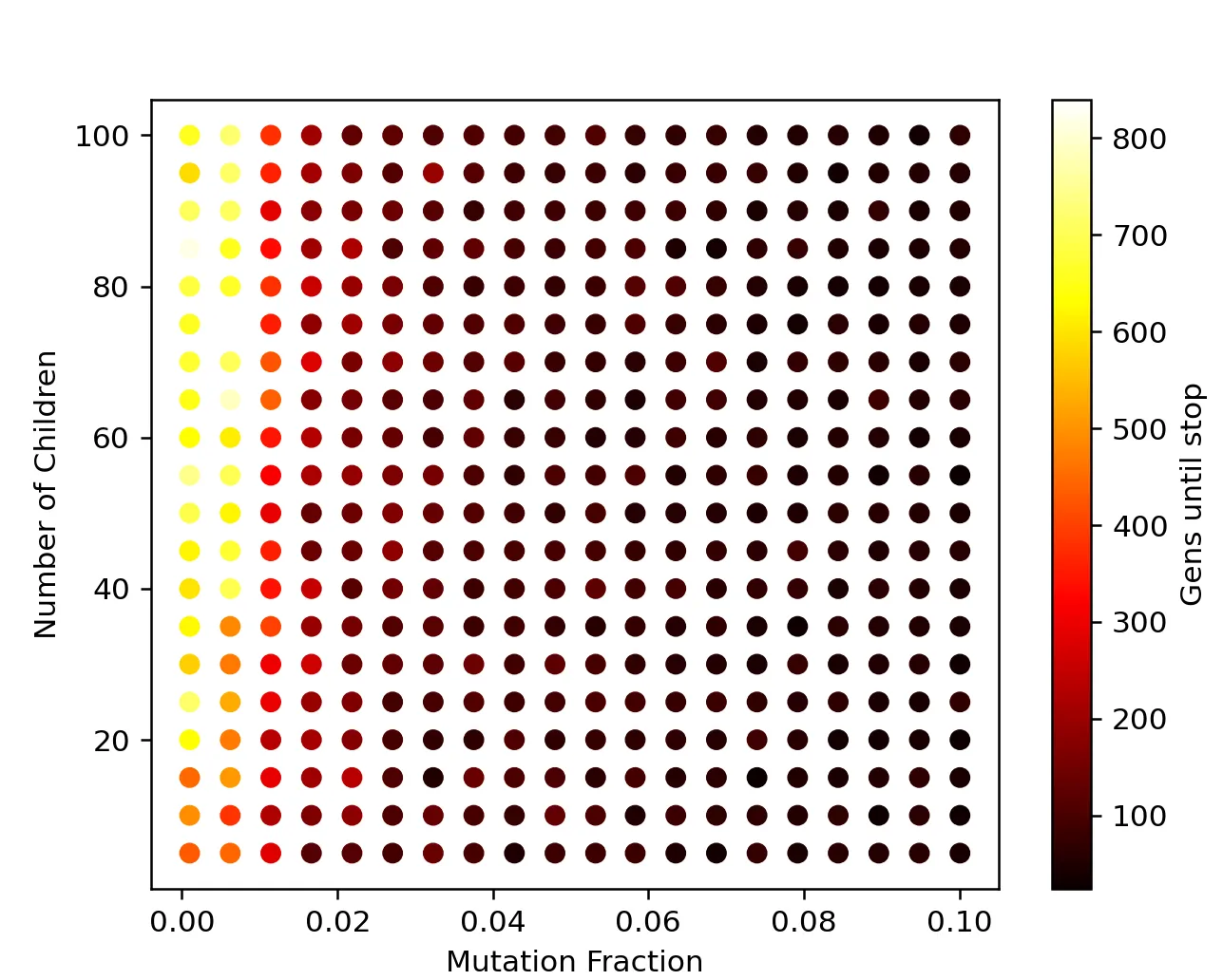
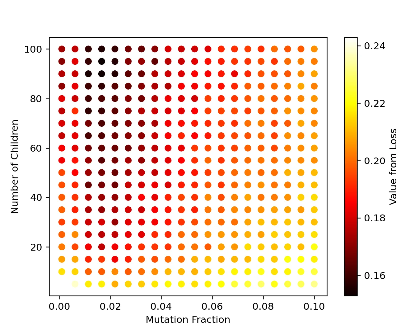
Below are some examples of tests I’ve already run that reveal some interesting things about evolutionary algorithms. For both plots, the x and y axes are the same: mutation fraction and number of children (this was run in single-lineage mode, so only one parent survives each generation). Both of these are sorta analogous to learning rate in machine learning.


On the left, the color indicates generations until no more progress is being made (higher is better). On the right, color indicates the loss (inverse of fitness) after a fixed number of generations (lower is better). The right graph is especially interesting because there is a clear peak indicating a ‘sweet spot’ for learning around x=0.02 and y>50.